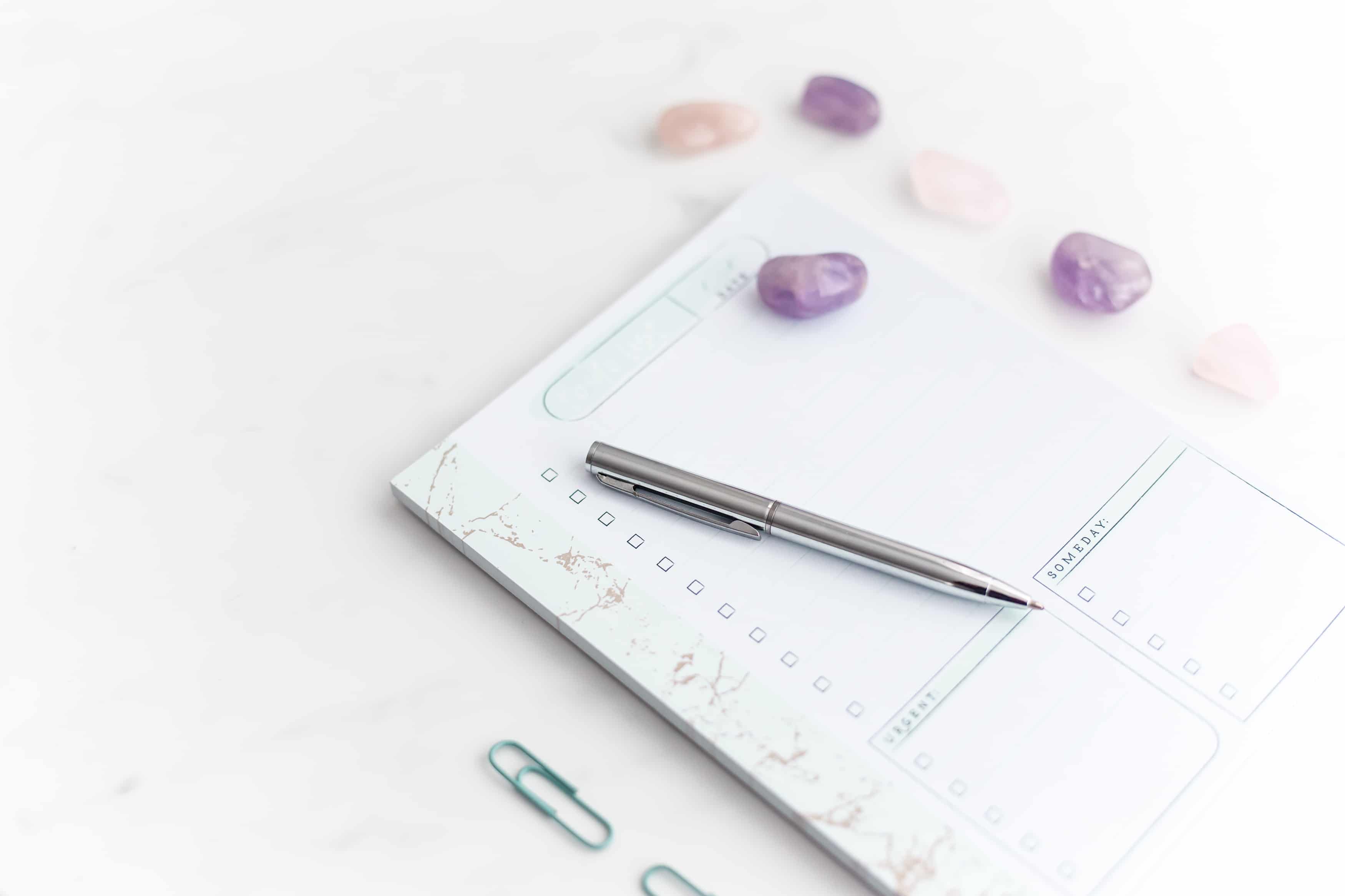
I am a fan of creating more with less. Maybe because I am a “less is more” kind of person? I love white space and little breaks that serve as breathing room through the day. (Insert a delicious cup of tea right here.) Well, content creation is a very scary topic for many bosses, and my friend, I don’t want you to feel this pressure. Let me show you how to maximize just one stock image to create multiple graphics.

Why is using an image (or a coordinating set) important?
Oh my friend, if I had a penny for every time I mistake a brand for another… and this is not my bird brain, in fact, I pay close attention to detail when it comes to branding (ahem, designer brain right here) and that’s when I see the little bumps in the road that others create for themselves:
• No brand consistency – some images are professional, some are not. Some have a completely different style from the other.
• They don’t use the same fonts in different touch points. – New brand? who this?
• Not using their brand colors. – Again, what’s up with playing with your colors and making your audience feel lost and disconnected?
All this is cured by taking little shortcuts like using one stock photo to create multiple graphics for the same campaign. And please take careful note that this doesn’t mean you should only use one photo for everything, or the same color and just one font family. My friend, this is about having your brand stand out and connect with your audience to get a better ROI on your marketing efforts.
Be consistent or be forgotten
Seriously. Scroll through Pinterest. You can easily spot someone’s pin because you recognize it, right? Well, that means their imagery, fonts, colors, and layouts always speak to you in the same way. Isn’t that neat? That brand just connected with you.
Now we can apply the same techniques and be smart about marketing and closing the gap between you and your ideal clients. (Sorry, design brain always kicks in.) A super easy way to make sure your campaign is recognized while bringing brand awareness to you is, of course, using your brand elements (fonts, colors, words… all the things mentioned above), and good, cohesive imagery. This can be a set of images that have the same style, vibe, pop or elements.
What if I only have this one image?
Well, then you maximize it like the boss you are! Here’s a quick video to show you how easy it is to create 4 different graphics from just on stock image. And a little shameless plug: Our stock images, freebies, and paid ones, are always high-resolution, which means you can crop in real tight and use different parts of the image to get multiple graphics done!
By the way, this also works to create 9 grid photos, I’ll show that in a later tutorial.
Try it out. Here’s a free stock photo bundle for you
Wasn’t that easy? Show me your take on it! Tag me on Instagram @atelier21co or send it over in our little chatbox on the homepage, I want to see your creations and cheer on your next marketing campaign!
Thought so. Put your email right here and get an exclusive set of 15 photos straight to your inbox! (I occasionally send more because why not?) I got you.
Want to get a taste of the stock images inside the A21Co membership? 👀
You'll be added to my VIP pen pal list (which is sent very sporadically) where you'll get freebies, news and first dibs on any promos.

